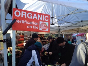
Yesterday, we spent part of the class discussing the “offline” field trip we took last week to a bricks and mortar grocer, as well as the homework assignment of checking out the physical experience of a local farmer’s market.

I thought I’d share and compile my own scribbles and observations of these experiences, and then try to find some online equivalents of some of these attributes. Here’s some of what I jotted down:
- Utilizing blackboards and colored chalk
- Integrating a coffee bar into the experience (even in the snow, the caffeine addicts queued up at the Farmer’s Market, albeit a bit miserably)
- Merchandising products with wicker baskets and other “rustic” elements like coffee bags (wicker baskets have even made it to our local Safeway)
- Weaving storytelling into the products/producers
- Prominently displaying “organic certification” signage

