
After last week’s introduction to user observation, this week I moved us over to our client site at Science World to practice further. Earlier in the week, Science World staff helped me pre-select three exhibits with known issues.
We began class by taking a look at a analog exhibit “Bucket Radio.” Later, I divided the class to conduct observations at two different exhibits that feature games: “Ernie the Electric Eel” and “Even More Contraptions.” At this point, I asked students to each spend at least 30 minutes observing the exhibit, making sure to note the visitor’s path as they interacted with the exhibit and any frustrations that they witnessed. The students were then tasked to come up with a non-technical solution in response to those frustration, as well as a wireframe for the digital solution.
Though kiosks obviously have a physical component rather than entirely digital, you’ll note that many of the issues discovered in this exercise are common to digital media as well: how to attract users; reducing a higher than desirable “bounce” rate; unloved onboarding/written instructions. What product doesn’t wrestle with these very same infernal issues?
Bucket Radio warm up
This exhibit often puzzles visitors because it’s not entirely obvious how one should interact with it. It’s simply a table with two metal prongs located on each end with two buckets resting close by. A small sign is mounted flush against the table, describing that the metal rods are transmitting sound which may be amplified by placing the bottom of the bucket against them. This exhibit is located in the midst of many other “hands on” exhibits. Here’s a (very rough) sketch of the table:
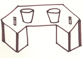
The exhibit curator described the typical visitors to this space. He detailed the many (usually incorrect) ways visitors interact with the table and wondered if we might have a few ideas on how to make it more obvious how it works. In less than 10 minutes, the class took a look around to see what visitors are generally doing in the space, how they interacted with some of the more successful exhibits, and then used this to generate a number of ideas about how to better present the exhibit.
Here’s what we came up with:
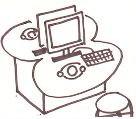
Ernie The Electric Eel game
The first kiosk is located in a new BC Hydro “Our World” gallery devoted to energy conservation. Essentially it’s a walk-up kiosk with a number of input devices (trackpad, buttons, joystick) that controls the Our World website. Primarily, visitors only choose to play the Ernie the Electric Eel game (playable here) because the kiosk limits user selections. The kiosk is set up like this:
The curator described some typical usage patterns–as you might have guessed by looking at the drawing above, this primarily involves users randomly clicking and pressing all of the buttons to try and get the kiosk to work. However, there were a number of other observations that the students made, with some possible solutions:
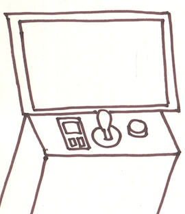
Even More Contraptions game
The second kiosk is a small table with two computers loaded with a puzzle physics game with a somewhat unfortunate location in the Eureka Gallery. Why unfortunate? It’s overshadowed by its much noisier and physically stimulating siblings. And when I say overshadowed, I mean it quite literally. It’s located in a rather dark corner. Here’s a rough sketch of the kiosk:

The exhibit curator described some of the user behaviors that plague this exhibit such as: users not knowing how to use the input devices; hardware breaking; and visitors escaping out of the game to access the internet. He also was looking for some means of gathering some basic player data so that Science World can continue to improve the exhibit and game selection. Much like with the other kiosk, students picked up on a lot more than what had been anecdotally noted by staff–here’s what the students came up with: